This specification describes how figures commonly seen in print – e.g. tables, photographs with captions, and pullquotes – can be formatted with CSS. By turning elements into page floats, figures can be floated wrt. columns and pages, and they can span columns. As such, the specification reinforces the concept of columns and pages being basic building blocks of CSS typography, thereby avoiding scripting for common layouts. Page floats live in paged environments, both on print and on screens. Authors do not know the size of the reader's device and care has therefore been taken to make features responsive; the same style sheet can work on mobile phones, tablets, PCs and on paper. This specification also describes how text can wrap around text and images.
Status
This specification builds on, and extends, features described in CSS Multi-column Layout [CSSMULTICOL] and CSS Overflow [CSSOVERFLOW]. Many of the features described have already been implemented, as described in the implementation coverage document. Based on implementation experience, some of the features have been revised and the CSS syntax has changed compared to earlier drafts. As such, the features described in this specification are mature, but their descriptions need more work.
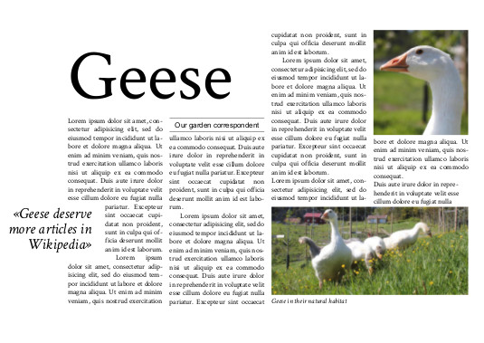
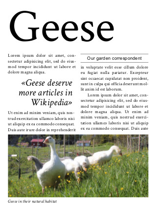
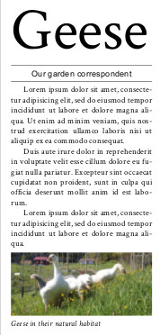
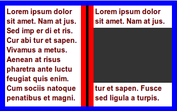
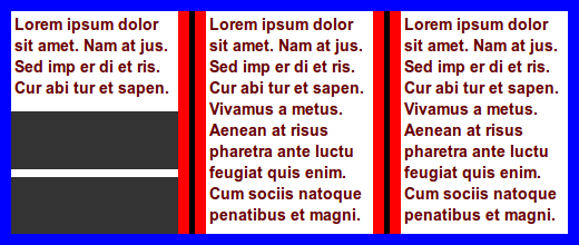
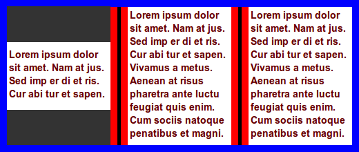
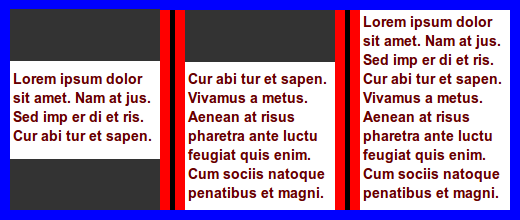
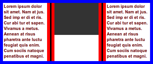
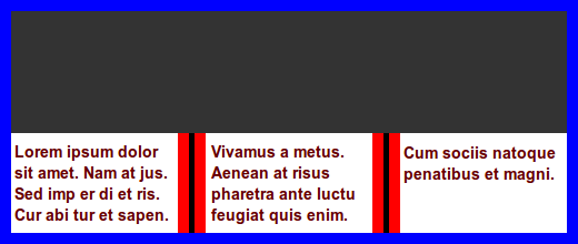
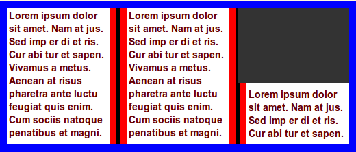
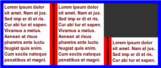
The main goal of this specification is to enable authors to create publications with common figures in paged environments, both on screen and on paper. Examples of figures include photographs with captions floated to the top of the page, tables that span several columns, and pullquotes that are positioned halfway down the last column. Further, the goal is for the CSS code to be compact, human readable & writable, reusable, and not depend on dummy structural elements. Media queries can be used in combination with CSS Figures, but the goal is for the same CSS code to apply to the widest possible range of devices. Below are screenshots of a sample document shown on various devices:
Figure 1Figure 2Figure 3
Notice how the heading and the wide image span two columns in figure 1 and figure 2. Also, the byline is deferred to the second column when there is more than one column. The images are floated to the top and bottom of the page; when there is not room for more than one image, the other is moved to the next page.
1 Conformance
All diagrams, examples, and notes in this specification are
non-normative, as are all sections explicitly marked non-normative.
Everything else in this specification is normative.
The key words "MUST", "MUST NOT", "REQUIRED", "SHOULD", "SHOULD NOT", "RECOMMENDED", "MAY", and
"OPTIONAL" in the normative parts of this specification are to be
interpreted as described in RFC2119. For readability, these words do
not appear in all uppercase letters in this specification.
[RFC2119]
Conformance requirements phrased as algorithms or specific steps
may be implemented in any manner, so long as the end result is
equivalent.
User agents may impose
implementation-specific limits on otherwise unconstrained inputs,
e.g. to prevent denial of service attacks, to guard against running
out of memory, or to work around platform-specific limitations.
2 Page floats
In page-based layouts, images and figures are often displayed at
the top or bottom of pages, spanning several columns. This
specification extends the CSS float model with page floats,
which are floats that move in the block direction, as
opposed to normal CSS float that primarily move in the inline
direcdtion. The 'float' property is used to specify that the page
float should move to the top, bottom or to the nearest edge of the
column.
All page float have a natural column, i.e., the column where the element would naturally start. This specification defines several ways by which the element can escape their natural column.
Page floats can be deferred to a later column, possibly on a later page, by using the 'float-defer-column' and 'float-defer-page' properties. These properties identify a page float's defer column on a defer
page.
Like for normal floats, page floats can be moved due to seetings on the 'clear' property; this speicification adds values so that an element can indicated preference for being the firat page float at a give position.
Page floats can be told to escape their natural column by using the 'float-reference' property to set the containing block to be an element, the page area, or the bleed box.
These properties allow rich designs to be described. However, there
may be implementation-specific limits for figure placement (such that
figures cannot affect content that has already been laid out), or that
blank pages should be avoided. In these cases, UAs may move the page
float to another column or page. The column where the page float is
shown is called the resulting column, and the page where
the page float is shown is called the resulting page.
2.1 Floating to the top/bottom
Floating to top or bottom of columns is a basic feature of
multi-column layout. To support this, some new keywords on 'float'
have been added:
top
The page float is moved to the top of its column, i.e., to the beginning (in the block direction) of its defer column (see Deferring page floats below). If other page floats have already taken the top position, the float is stacked below or moved to the top of another column (see Clearing Page floats below).
block-start
alias for 'top'
bottom
The page float is moved to the bottom of its column, i.e., to the end (in the block direction) of its defer column. If other page floats have already taken the bottom position, the float is stacked above or moved to the bottom of another column.
block-end
alias for 'bottom'
top-bottom
The page float is moved to the top of its column, i.e., to the beginning (in the block direction) of its defer column. If that position is not possible (due to 'column: clear' being set, or due to lack of space), other possibilities are tried in order: the bottom of its column, the top of the next column, the bottom of the next column, etc.
block-start-end
alias for 'top-bottom'
bottom-top
The page float is moved to the bottom of its column, i.e., to the end (in the block direction) of its defer column. If that position is not possible (due to 'column: clear' being set, or due to lack of space), other possibilities are tried in order: the bottom of its column, the top of the next column, the bottom of the next column, etc.
block-end-start
alias for 'bottom-top'
When one of these keywords are set, a page float is created.
Float the figure to the top of its natural column:
figure { float: top }
The column is, by default, the containing block of the page float.
When the width is auto, the page float will fill the width of the
column. When the width is constrained, content will be laid out in the
line direction.
In this example, the width of the figure is constrained and its width computed relative to the column width.
figure { float: top; width: 50% }
2.2 Floating to nearest edge: snap()
Figures that naturally end up close to a column break may look better when moved to the top or bottom of the column. To support this, the snap value is added to the 'float' property:
snap(<length> <length>? [, top | bottom | near ]?)
Turns the element into a page float if it naturally appears within a certain distance from the top or bottom of the column. The optional length value(s) specifies the maxium distance from the top/bottom that an element must be within in order to become a page float. When one length value is specified, it represents distance from both the top and the bottom; when two length values are specified, they represen the distance from top and bottom, respectively. Integer values represent number of lines in the baseline grid, if set. If no baseline grid is set, integer values represent multiples of the used value of 'line-height' on the element itself.
The optional keyword value specifies where the element is floated: top, bottom, or the nearest of the two. The default value is 'near'. If 'near' is in effect and the element is within the specified distance both from the top and the bottom, bottom wins.
snap
same as snap(2em, near)
Should an element be considered to be a float if it has a snap() value, even if the element does not appear within the specified distance? This way, it can be determined whether an element is float or not without laying out the document.
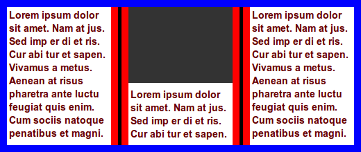
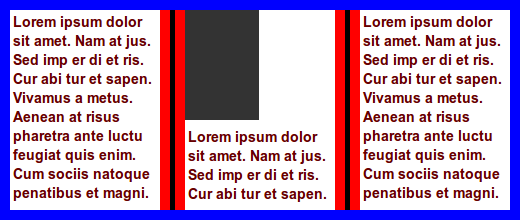
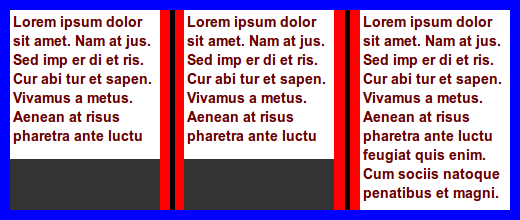
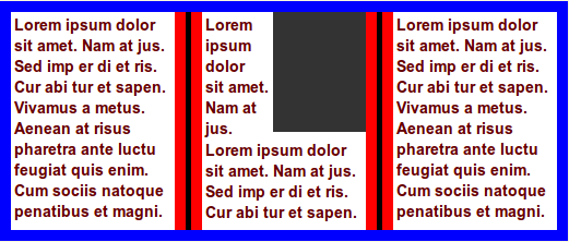
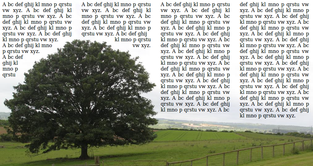
In this example, a figure naturally appears close to a column break. There is not enough space for the figure in the first column, and it is therefore placed in the second column, leaving white space at the bottom of the first column.
To avoid the white space, the image can be floated to the nearest edge (in the block direction):
.figure { float: snap }
When the code is applied, subsequent content is allowed to be displayed before the page float the white space can therefore be filled:
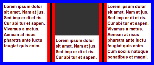
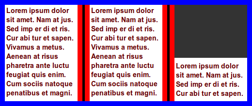
In this example, two figures naturally appear in the text flow:
A typographer would typically try to avoid single lines of text above/below figures, which can be achieved with:
div.figure { float: snap(1em) }
The length value specifies the reach of the snap function; in this example the second figure is affected, but not the first.
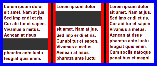
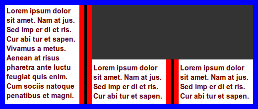
In this example, two figures naturally appear in the text flow:
To make both figures snap to the nearest edges, this code can be applied:
div.figure { float: snap(3em) }
The resultant rendering is:
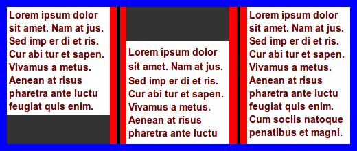
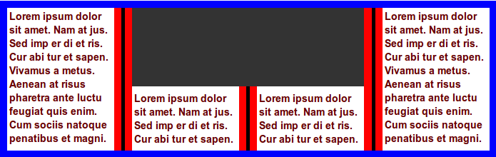
In this example, two figures naturally appear in the text flow:
To make both figures snap to the nearest edges, this code can be applied:
div.figure { float: snap(3em, bottom) }
The resultant rendering is:
To determine the exact meaning of 'near', the Japanese layout requirements document should be consulted.
2.3 Setting the page float reference: 'float-reference'
Normally, page floats are moved to the top or bottom of a column, and the column is the contaning block of the page float, called a float reference. In some cases it is necessary to change the float reference to be an element, the page area, or the bleed box. This is possible with the 'float-reference' property.
Name:
float-reference
Value:
column | element | page | bleed-box
Initial:
column
Applies to:
page floats
Inherited:
no
Percentages:
N/A
Media:
visual
Computed value:
Same as specified value
This property indicates the float reference for a page float. The values are:
column
the resulting column is the float reference
element
the float reference is the youngest ancestor element that creates a block formatting context
page
the page area of the resulting page is the float reference
bleed-box
The bleed box of the resulting page is the float reference. The extent of the bleed box is described by the bleed property.
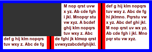
In this example, the footer is floated to the bottom of the page:
The double line below the footer indicates that the columns stretch to below the footer element. Note that column rules are not displayed under the area described by column spans.
This example results in a rendering which is similar to the previous example, but the style sheet is different:
In this example, the full-page ad uses the bleed box as the referece. Thus, when the image width and height are set to 100%, the image will extend slightly outside the page box on all sides. Exactly how much depends on the value of the bleed property.
In this example, a figure fills the upper half of the page to its bleeding edge.
In the rendering below, the stippled line indicates the bleed box, the green rectangle is the aside element which is aligned with the bleed box on the top, right and left. The black solid line is the page box.
A page float can be deferred to a following column, page, or line with three new properties described in this section. These properties allows content to be declared earlier in the markup to request to be shown on a subsequent pages, in a certain column, or at a certain place in a column. For example, advertisements and pull-quotes may be declared at the beginning of an article and shown interspersed with the content. The properties are applied in order. First, the UA applies 'float-defer-page' to find the defer page. Second, the 'float-defer-column' is applied to find the defer column on that page. Third, the 'float-defer-line' is applied to find the defer line. These properties are evaluated before the 'clear' property.
2.4.1 'float-defer-page'
Name:
float-defer-page
Value:
[ <integer> || last || [left | right] ] | none
Initial:
none
Applies to:
page floats
Inherited:
no
Percentages:
N/A
Media:
visual
Computed value:
specified value
This property specifies a defer page, which is a later column where the formatter will try to place the page float. Values are:
none
the defer page is the natural page
<integer>
A positive integer indicates that the page float is deferred by the specified number of pages. A negative integer indicates that the page float is deferred by counting from the last page; -1 means the last page, -2 means the next-to-last page, etc. If the specified negative integer would result the defer page being a page column, the value is ignored. Also, zero is ignored.
Should negative values be allowed?
left
A left page is requested. If pages are not categorized as left of right, this value is ignored. In combination with an integer, this keyword has the effect that the defer page is increased by one, unless the integer value results in a left page.
right
A left page is requested. If pages are not categorized as left of right, this value is ignored. In combination with an integer, this keyword has the effect that the defer page is increased by one, unless the integer value results in a right page.
last
The last page becomes the defer page. In combination with 'left', this value means next-to-last unless the last page is a left page. In combination with 'right', this value means next-to-last unless the last page is a right page.
Float figure to the top of the column that follows the natural column:
figure { float: top }
figure { float-defer-column: 1 }
Float figure to the top of the next-to-last column:
figure { float: top; float-defer-column: -1 }
Float figure to top of the last column of the multicol element on the current page:
figure { float: top; float-defer-column: last }
In combination with 'column-span', the figure is floated to the top corner of the multicol element on that page:
figure { float: top; column-span: 2; float-defer-column: last }
Float figure to the second column on the next page, spanning two columns:
Given that there are four columns, and that the figure is referenced at the beginning of its multicol element, the same layout could be achieved with this code:
Float figure to the top of the last column on the natural page:
.figure { float: top }
.figure { float-defer-column: last }
Float figure to the last column on the last page:
.figure { float: top }
.figure { float-defer-column: last }
.figure { float-defer-page: last }
2.4.2 'float-defer-column'
Name:
float-defer-column
Value:
none | <integer> | last | inside | outside
Initial:
none
Applies to:
page floats
Inherited:
no
Percentages:
N/A
Media:
visual
Computed value:
specified value
This property specifies the number of columns that the page float should be deferred. Values are:
none
the page float should not be deferred by this property
<integer>
A positive integer indicates that the page float is deferred by the specified number of columns. If the number results in column that does not exist, the last column should be attempted. A negative integer indicates that the page float is deferred by counting from the last column; -1 means the last column, -2 means the next-to-last column, etc. If the specified negative integer would result the defer column being a previous column, the value is ignored. Also, zero is ignored.
last
The last column on the natural page becomes the defer column.
inside
The next inside column becomes the defer column.
outside
The next outside column becomes the defer column.
2.4.3 'float-defer-line'
Name:
float-defer-line
Value:
none | <integer> | <percentage>
Initial:
none
Applies to:
top-floating page floats
Inherited:
no
Percentages:
see prose
Media:
visual
Computed value:
positive integer
This property specifies the number of lines a page float should be deferred.
Values are:
none
the page float should not be deferred by this property
<integer>
A positive integer indicates that the page float is deferred by the specified number of lines counting from the start of the column, so that the specified number of lines can be displayed before the page float. A negative integer indicates that the page float is deferred by the specified number of lines counting from the bottom of the column, so that the specified number of lines can be displayed after the page float.
<percentage>
Percentage values express that the page float is deferred a certain number of lines relative to the height of the column. Negative percentages or percentages above 100% are ignored. A value of 0% means that no lines are deferred, while a value of 100% means that all lines are deferred. A value of 50%' will defer the page float so that it has the same number of lines above it and below it (assuming uniform text throughout the column, and an even number of lines).
Both integer and percentage values are computed to a positive integer value which represents the number of lines from the top of the column which is to be deferred. Line metrics are based on the first available font of the multicol element. Other page floats or spanners are not taken into account when computing lines.
Move a pullquote to the top, bar two lines.
.pullquote {
  float: top;
  float-defer-line: 2;
}
This code positions the float in the middle of the column:
Elements may request to clear page floats with the 'clear' property:
column
The page float requests to be the first page float at its favored position in the column; rather than being stacked after other page floats, it should be moved to the next possible position.
page
The page float requests to be the first page float on the page. If there is already another page float on the page, the page float is moved to the next page.
The placement process is iterative; if the requested position cannot be honored, the page float the next possible position is tried, etc.
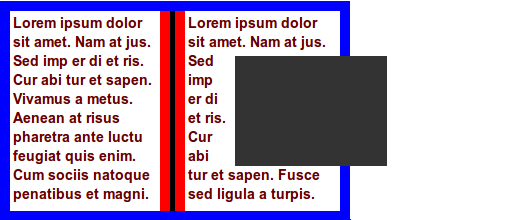
In this example, the two figures may appear in the same column:
The placement of the second float is due to the 'top-bottom' indicating that the bottom as an acceptable position, and due to it being the first page float in the bottom position.
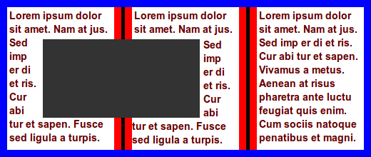
In this example there are three figures, all requesting to be the first page float in their favored position. The first figure will move to the top of its natural column, the second will move to the next-best position, which is the bottom of the natural column. The third-best position is the top of the next column, which is where the third figure will be placed.
Page floats can request that subsequent content is avoided by
setting margin values in the block direction to 'auto'.
  img {
    float: top;
    margin-bottom: auto;
  }
2.7 Page float preferences: 'float-policy'
Name:
float-policy
Value:
normal | [ drop-tail || in-order ]
Initial:
normal
Applies to:
page floats
Inherited:
no
Percentages:
N/A
Media:
visual
Computed value:
specified value
Values are:
normal
no extra constraints are added
drop-tail
treat page float as if 'display: none' had been set if it would appear after all other content in the normal flow
in-order
page floats must be shown displayed in source order
forward
page float must only move forward relative to its anchoring point
Show one (and only one) pull-quote per page, in the second column. If there are more pull-quotes than pages, the remainders are not shown; we don't want a stack of pullquotes at the end of an article.
The properties described above allow rich designs to be described.
However, in many cases page floats must be moved to another column or
page than specified. This may be due to implementation-specific limits
for figure placement (such that figures cannot affect content that has
already been laid out), or that there simply isn't room in the column
specified. UAs are free to find the best resulting column and page.
When resolving over-constrained layouts, the order of importance for defined goals are:
display all content (as described by other CSS properties)
keep the number of pages to a minimum
place the page float as close to its natural position as possible
display content in the document order
avoid pages with only page floats
The number of columns is limited, and high values therefore cannot be honored. As a result, the last column on the natural page is tried instead.
.figure { float: top; float-defer-column: 1000 }
A narrow screen may only have room for one column, in which case this request cannot be honored. As a result, the natural column should be tried instead.
.figure { float: top; float-defer-column: -5 }
In long documents with many paragraphs, all paragraphs will not fit on the last page. Therefore, the last declaration in this example cannot be honored and must be ignored:
If all content fits on one page, the first page will also be the last page. The first element is processed first and is placed on top of the first/last page. Then the second element is processed. It requests a clear top, something which is not possible on the first page. Therefore, a second page is created and the second element is moved there, while the first element remains on the first page. Thus, even if the first element requests to be on the last page, it will not appear there.
3 Spanning columns
The page float's containing block can be extended by the
'column-span' property. A typical use case is to make the page float
span two columns, but parts of columns or column gaps can also be
specified. This specification extends the 'column-span'
property [CSSMULTICOL] with new values:
number, length, and the 'auto' value.
Name:
column-span
Value:
none | all | <integer> | <length> | auto
Initial:
none
Applies to:
in-flow block-level elements (but see prose)
Inherited:
no
Percentages:
N/A
Media:
visual
Computed value:
Same as specified value
This property describes how the element spans across columns of the nearest multicol ancestor.
none
the element does not span multiple columns
all
The element spans across all columns, as per [CSSMULTICOL]. This value results in previous content being balanced across all columns before the spanning element; no other value has the this effect.
<integer>
The page float spans across the number of columns specified.
<length>
The length value determines how many columns the page float will span, rounding upwards to an integer number of columns.
auto
The intrinsic width of the page float determines how many columns it will span, rounding upwards to an integer number of columns.
If the resulting number of columns is larger than the number of columns in the multicol element (not counting overflow columns), the number of columns spanned will be the same as the number of columns in the multicol element.
In the line direction, the rectangle described by this property is, by default, placed at the start of the resulting column, extending in the line direction. However, the rectangle will not normally extend outside the content box of the multicol element. Instead, the rectangle is extended in the opposite direction of the line direction. (Negative margins and/or 'float-offet' may possibly move the page float outside the content box.)
In this example, the defer column is the last column on the page. Due to the setting on 'column-span' the page float also covers another column. As it cannot extend outside the content box of the multicol element, it must extend to the left into column 2.
Page floats are floats that primarily move in the block direction,
while normal floats primarily move in the line direction. By setting
two keywords – one for the block direction, and one for the line direction – floats can be set to move in both directions. These are
called two-dimensional floats, or 2D floats.
Syntax: [ top | bottom | top-bottom | bottom-top | snap() ] || [ left | right | inside | outside ]
(Also, alises for the above keywords are legal)
Float figure to the top right of the current element, allowing other content on its side:
.figure { float: top right; width: 60% }
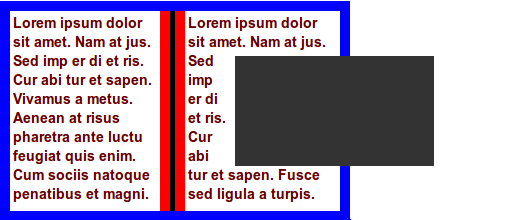
In this example, the image is set to span two columns, but it does not use all available space.
therefore intrude into the neighboring column. At the bottom of the
middle column is a long word that is clipped in the middle of the
column gap.
img { float: top left; column-span: 1.70; width: 100% }
4.1 Offsetting floats: 'float-offset'
Name:
float-offset
Value:
none | <number> | <percentage> | auto
Initial:
none
Applies to:
floats
Inherited:
no
Percentages:
relative to width of float
Media:
visual
Computed value:
Same as specified value
This property move a float along the line axis. Positive length values move the float in the opposite direction of where it has been floated by the 'float' property, negative values move the float in the same direction it has floated by the 'float' property.
In this example, figures are floated towards the outside of the page by the 'float' property. The negative value on the 'float-offset' property floats figures further towards the outside:
figure {
  float: outside;
  float-offset: -3em;
}
Move an element to the last column, two lines from the top, pushing the float slighly to the right:
Place an element between two columns, two lines from the top:
figure {
  float: top left;
  float-defer-line: 2;
  float-offset: 50%;
}
5 Floating inside and outside pages
To allow content to flow to the inside and outside of a page, two new keywords are added to the 'float' property:
inside
On a right page, this value is synonymous with 'left'. On a left page, this value is synonymous with 'right'.
outside
On a left page, this value is synonymous with 'left', On a right page, this value is synonymous with 'right'.
.figure { float: outside }
Position pullquotes so that that they appear in the outside column, extending into the outside margin.
.pullquote {
  width: 120%; /* relative to column width */
  float: top outside;  /* position page float at the top... */
  float-defer-column: outside /* ... of the last column */
  float-defer-line: 50%; /* move page float down */
  float-offset: -50%; /* push page float into margin */
}
It is common for content in sidenotes to be aligned based on whether the note appears on a left or right page. To support this, two new keywords are added to the 'text-align' property:
inside
same as 'left' on right pages, same as 'right' on left pages
outside
same as 'right' on right pages, same as 'left' on left pages
7 Wrapping around page floats (and other elements)
7.1 wrap-side
Name:
wrap-side
Value:
none | [[ all | left | right | top | bottom | line-start | line-end | block-start | block-end | line ] || <integer>? ]
Initial:
none
Applies to:
page floats (or, perhaps, all floats?)
Inherited:
no
Percentages:
N/A
Media:
visual
Computed value:
specified value
Do we need this, or just a flag to allow intrusions?
This property indicates whether other content may wrap around a page float:
none
other content may not wrap around the page float
all
other content may wrap around on all sides of the float
left | right | top | bottom | line-start | line-end | block-start | block-end
specifies which side wrapping is allowed
line
wrapping is allowed on both sides in the line direction.
<integer>
specifies the maximum number of lines that may wrap around the float. Must be combined with one keyword that specifies which side(s) wrapping is allowed.
p:first-letter { float: left; font-size: 3em; wrap-side: 1 line }
And so, away with thisfolly. Science, in-stead of being theenemy of poetry, is its quar-termaster and commissary.
7.2 wrap-contrast
Name:
wrap-contrast
Value:
normal | [ <number> <length>?
Initial:
none
Applies to:
page floats (or, perhaps, all floats?)
Inherited:
no
Percentages:
N/A
Media:
visual
Computed value:
specified value
This property specifies the minimum contrast. Values are:
normal
a reasonable default value is set, based on the avarage eyesight of 48-year old males, TBD.
<number>
a number where '0' represents no contrast (thereby allowing other content to intrude the entire float), and '1' represents a maximum contrast only achieveable between black and white (is this correct?)
<length>
specifies the minimum distance from the edge of the contrast line to the start of the intruding content. If not specified, this value is '1em'.
In this example, text wraps around all sides which have enough contrast.
This document has been improved by Bert Bos, Michael Day, Melinda
Grant, David Baron, Markus Mielke, Steve Zilles, Ian Hickson, Elika
Etemad, Laurens Holst, Mike Bremford, Allan Sandfeld Jensen, Kelly
Miller, Werner Donné, Tarquin (Mark) Wilton-Jones, Michel Fortin,
Christian Roth, Brady Duga, Del Merritt, Ladd Van Tol, Tab Atkins Jr.,
Jacob Grundtvig Refstrup, James Elmore, Ian Tindale, Murakami Shinyu, Paul E.
Merrell, Philip Taylor, Brad Kemper, Peter Linss, Daniel Glazman, Tantek Çelik, Florian Rivoal, Alex Mogilevsky, Simon Sapin, Cameron McCormack, Liam R E Quin, Peter Moulder, Morten Stenshorne, Rune Lillesveen, Lars Erik Bolstad, Anton Prowse, Michel Onoff
 To the extent possible under law, the editor has waived all copyright and related or neighboring rights to this work. In addition, as of 12 December 2016, the editor has made this specification available under the
Open Web Foundation Agreement Version 1.0, which is available at http://www.openwebfoundation.org/legal/the-owf-1-0-agreements/owfa-1-0.
To the extent possible under law, the editor has waived all copyright and related or neighboring rights to this work. In addition, as of 12 December 2016, the editor has made this specification available under the
Open Web Foundation Agreement Version 1.0, which is available at http://www.openwebfoundation.org/legal/the-owf-1-0-agreements/owfa-1-0.